Tips For Responsive Design
Introduction
Some CSS properties as width, height and position can damage responsive design. You need to be careful while editing your website.
Editing Element Dimensions
If you need to edit the element’s dimensions on your website, we recommend you make these changes on the responsive tool.
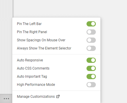
YellowPencil Preserves Responsive System
If you are a beginner, we recommend you keep the Auto Responsive feature on. By default, this feature is on. This feature applies the changes only for desktops (if needed) and maintains a stable responsive system.
Drag & Drop Feature And Position Property
Use position property only for small edits; don’t make significant position changes.
Negative Margin
Don’t use negative margins, if need, handle carefully.
Before Save Changes
Don’t forget to check the page with Responsive Tool to be sure it works well on all screen sizes before saving changes.
If you have messed up the responsive design, you can find and delete CSS properties which damage the mobile view by using the review changes tool.
If you don’t know how to use the responsive tool, please check this article to learn how this work.
Was this article helpful?
YesNo