Responsive Tool
Introduction
YellowPencil comes with an advanced responsive tool that lets you customize your website for any device.
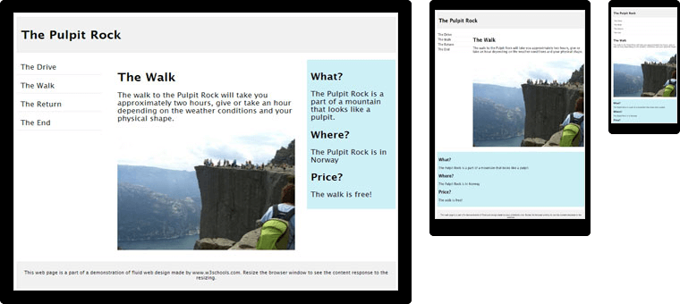
Responsive Web Design makes your web page look good on all devices (desktops, tablets, and phones). Responsive Web Design is about using CSS and HTML to resize, hide, shrink, enlarge, or move the content to make it look good on any screen:
Opens Responsive Tool
You can open the responsive tool from the left bar.
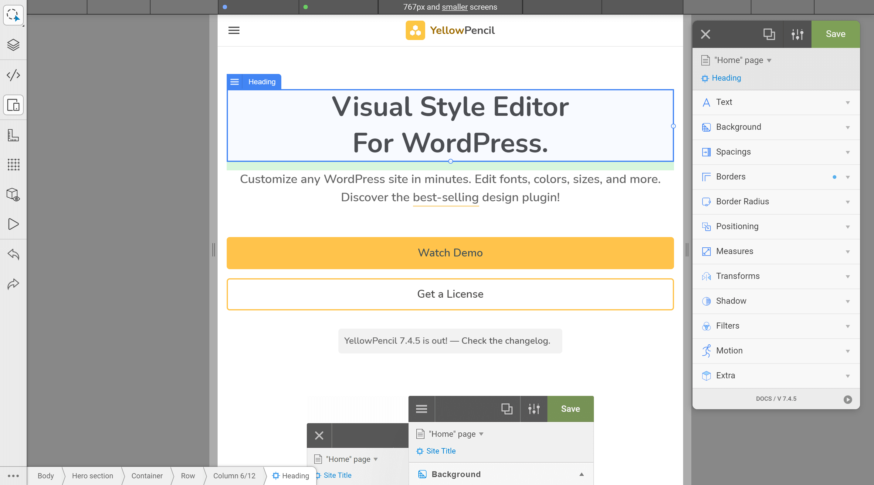
The Responsive Tool Interface
Click on the image to zoom in.
What Are Breakpoints?
Breakpoints are points where the website content responds according to the device width, allowing you to show the best possible layout to the user.
What is the breakpoint condition?
Breakpoint conditions specify when styles in the breakpoint will be applied.
YellowPencil provides breakpoint conditions just based on width property; apply a style if the screen size is below than x width or apply a style if the screen size is above than x width.
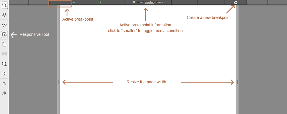
All breakpoints from the theme and plugins appear to the responsive tool. By default, the tool shows breakpoints that have the smaller (max-width) condition. You can change it as the larger (min-width) condition by clicking on the smaller link.
Smaller (max-width) condition:
If you applied a style to 900px breakpoint with smaller (max-width) condition, this style appears to the devices has 900px and smaller screen sizes.
Larger (min-width) condition:
If you applied a style to 900px breakpoint with larger (min-width) condition, this style appears to the devices has 900px and larger screen sizes.
Manage Breakpoints
You can manage styles just that you have applied to a specific size with the responsive tool.
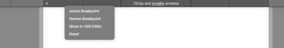
Right-click on the breakpoints and manage them as you want.
How apply a style to specific screen size?
Resize the page width as you want, select an element, and apply a style by using the element inspector and right panel.
How to test responsive compatibility?
Slowly resize the page width with the responsive tool and be sure this looks good on all screen sizes.
Can I add media queries with a custom condition?
Yes, you can add by using CSS editor.
Tips
- Use % instead of the pixel for measures properties.
- Use display property to hide elements from right panel > extra.
Popular breakpoint sizes:
- Below of 768 pixels is xsmall devices.
- 768 pixel and above is small devices.
- 992 pixel and above is medium devices.
- 1200 pixel and above is large devices.