The Element States (Pseudo-Classes)
Introduction
A pseudo-class is used to define a special state of an element.
- Style an element when a user mouses over it
- Style visited and unvisited links differently
- Style an element when it gets focus
Using The CSS States
After selecting the element that you want style, right-click to the selected element. There you will see available states, choose a state and start styling.
Example: If you applied style for hover state, the styles are not be visible when you mouse over the element on the editor. You must activate hover state to see the changes you have applied, from the right-click menu. On the website or the preview, the state will work normally.
The Available CSS States In The Editor
You may not see all the following states in the right-click menu, the editor shows just the appropriate states for the selected element.
| State | Description |
|---|---|
| Hover | Applies styles to the element on mouse over. |
| Focus | Applies styles to the <input> element that has focus. |
| Unvisited | Applies styles to all unvisited links. |
| Visited | Applies styles to all visited links. |
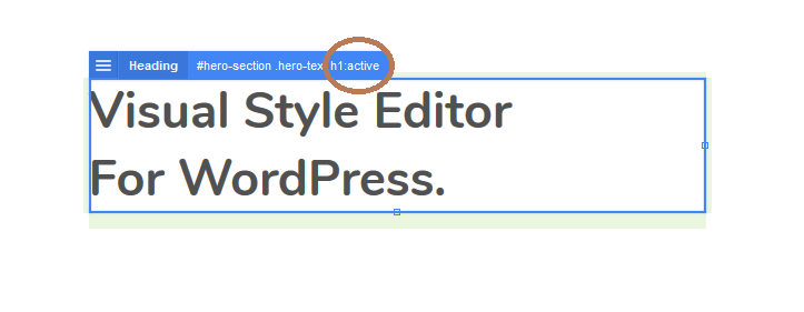
| Active | Applies styles to the active link. |
| Checked | Applies styles to every checked <input> element. |
| Disabled | Applies styles to every disabled <input> element. |
| Enabled | Applies styles to every enabled <input> element. |
| Invalid | Applies styles to all <input> elements with an invalid value. |
| Valid | Applies styles to all <input> elements with an valid value. |
If you don’t see the CSS state you need in the menu, you can edit the selector. Right click to the selected element, and choose edit selector in the right-click menu and edit the selector.
You can access all CSS states from w3schools.
Was this article helpful?
YesNo